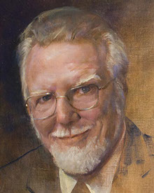
The Coleman Pavilion Diptych:
“Four Doctors of Early 20th Century CME” and “Five Doctors of Early 21st Century LLU”
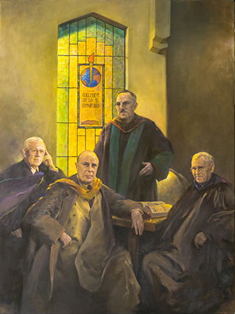
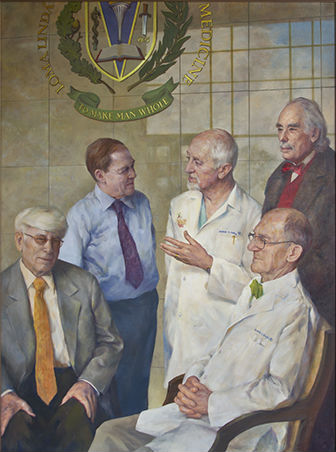
“Four Doctors of Early 20th Century College of Medical Evangelists” and “Five Doctors of Early 21st Century Loma Linda University.” These are two large mutually complementary and supplementary commemorative paintings, a pair, painted in the classical realistic style, displayed together in an alcove in the foyer of the Coleman Pavilion, all together constituting a classical diptych, an artistic whole, such as graced medieval basilicas but to be seen in no other medical school.
It was Dr. Ray Herber, CME/LLU ’57, whose mind’s eye envisioned such a diptych t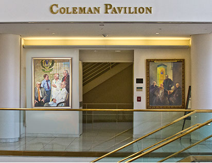 o enshrine the heritage of CME/LLU SOM, and it was Dr. Wesley Kime, CME/LLU 53A, whose brush brought the paintings to reality. Traditionally, fine art is accompanied by a commentary, and this pair of paintings warrants dual treatment, one by Dr. Herber about the cultural and historic significance and the meaning and symbolisms of the paintings, presented elsewhere, and another by Dr. Kime about the technical artistic aspects, presented here, in his words:
The artistic styles used in these paintings – the lighting, tonal palette -- and the settings, poses, and dress were chosen not only for their artistic qualities, but also to convey the essence of eras almost a century apart.
Thus the “Four Doctors of Early 20th Century CME” echoes the famously “arty” dark interiors and dim lighting, the heaviness and penumbra, characteristic of the era, with a shaft of light from a stained glass chapel window (like in Burden Hall) giving a golden glow to everything. The exemplar of that style is John Singer Sargent’s ‘Four Doctors of Johns Hopkins University School of Medicine,’ to which our ‘Early 20th Century’ pays homage.
But the “Five Doctors of Early 21st Century LLU” is the opposite, full sunshine and noontime brightness thanks to great walls of glass rather than stained glass fenestrations, imparting a cool bluish cast to the painting. The figures, now posed against gleaming, reflective marble rather than dull plaster, are fully and more diffusely lighted and of a cool tint. If this painting is derivative of any classical models, they are “Whistler’s Mother” and Norman Rockwell’s “Four Freedoms.” I have dubbed it “the Smartphone selfie style.”
In the earlier period, early 20th century, all academic people, such as those of CME when striving to achieve accreditation and recognition for the university, were wont to don full academic regalia over double breasted suits and vests for group portraits and apparently even for routine conferences (Sargent’s four Johns Hopkins doctors was the model), as they did formal wear for dinner. But in the “5 Doctors of The Early 21st century,” apparel is a quantum more functional and informal on all occasions (save graduation), though bow ties are still to be seen, and suits that emeritus-age professors wear are single-breasted. Dr. Slater (left lower quadrant) wears sport jacket and dark glasses, characteristic of him. (A commemorative painting depicting the beginning of the 22nd century, if time lasts, may show the Dean in a kaftan, or spandex.)
About a century ago our university logo was unprepossessing and incorporated into the motif of the stained glass windows, but now, whether because of modern architectural design or university self-image, the LLU logo is commandingly huge and emblazoned upon a vast marble plane. As to the symbolism of our burgeoning logo displacing stained glass windows, and the campus and the cloudy sky being reflected upon the marble above the figures, Dr. Herber is to be consulted.
Now then, whether it is a Sargent painting hanging on the wall of Johns Hopkins university or a smartphone selfie on Facebook, “composition” is the single most crucial thing. In art, “composition” is the technical term for how the various things depicted in a painting are arranged to please the viewing eye and keep it moving, sprinting or ambling, in the most orderly and effective way. For real estate, it’s location, location, location – for this pair of paintings, the proper adjoining locations in the Coleman Pavilion. For paintings, it’s composition, composition composition!
For most people I would have to describe the composition of both these paintings as pyramidal. How helpful is that? But medical people are lucky. When I say that a graph of the composition of these paintings looks like a vectorcardiogram, you understand what I mean, don’t you? And do we need a Dr. Herber to inform us of the apt symbolism of a heart serving the composition?
Anyway, every component of the pictures – the precise directions of the faces and the expressions on them; the shape and color and direction of the fall of neckties, or whether neckties or bow ties, their colors; the hands whether folded or pointing or hidden; the complexity, texture, and color of suit or clinical coat or sweater, even the lay of the name labels on the lab coats; the position and size of the logos; everything – can be represented by an array of time-sequence vectors in 3 dimensions, all together making the loop which maps the movement of your eyes as you view the paintings. That’s composition.
Formerly it would take an artist many months to compose on paper and canvas, as preliminary sketches, all these elements. I will tell you a secret. I made not one preliminary sketch. All that rearranging and composing and modifying and perfecting – e.g., rearranging Sargent’s Johns Hopkins figures and lighting to accommodate a stained glass window, rendering it less rococo and more in keeping with the persona of early day CME -- all planning and preparation, that horrendous task, was accomplished by computer, and Photoshop.
Finally, the frames. To most effectively serve both the commonality and the contrast of our two paintings, the different eras and identical goals, the differences and similarities of mood and painting style, their frames are different, yet matching. To set off the style and mood of the classical era, the frame for the “Four Doctors of The Early 20th Century” is comparably elaborate and gilded, on an umbrous matrix. To set off the casual, simplified, streamlined worldview of the current era, and also the architecture and marble of the Coleman Pavilion, the frame for the “..21st Century” is clean and smooth and silvery. By the way, Dr. Herber himself paid for both of them. That itself deserves a commentary.
Sargent, "four Doctors of Johns Hopkins
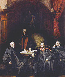
Sargent, "Four Doctors of Johns Hopkins"
